Unit 4. Typography
A. TYPE LAYOUT
B. POSITIVE/MOTIVATIONAL POSTER
Visual Hierarchy:
Student Examples:

|

|

How a student took the stronger design they made and added to it later...
|

|
Visual hierarchy refers to the arrangement or presentation of elements in a way that implies importance. In other words, visual hierarchy influences the order in which the human eye perceives what it sees. This order is created by the visual contrast between forms in a field of perception.


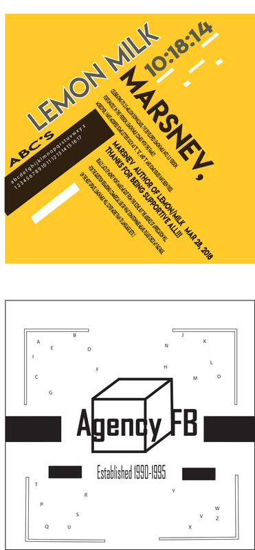
Typography Layout Part A
TYPE LAYOUT
SKETCH & FIND 1 REFERENCE BEFORE STARTING! (10pts)
*Choose 2 fonts to start
Start by creating 2 layout designs:
• 1 of them: GREYSCALE! NO COLOR…
• 1 of them: 1 COLOR! MONOCHROMATIC
• 8inch by 8inch documents in Illustrator
• At least one enlarged letter in each design (unrecognizable)
Terms to Know:
Visual Hierarchy
Monochromatic
Typography
Alignment
What will we be doing?
1. Choose two different font types (one per design)
2. Start by researching the font you want to use:
Links for Fonts:
dafont.com
Identifont.com
Myfonts.com
Wiki
*Make sure you can download the font for FREE
Dafont.com or another site!
3. Think about the style of the font and what it artistically reminds you of.
How can this be utilized in the layout?
4. Think about visual hierarchy... what do you want the viewer to see first?
Title of font
Creator
Invention Date
Other information about this font/ or your own description!
5. Sketch two designs for each of the fonts in a square formation. We will be making them 8 by 8 inches on the computer.
6. Open a new 8 by 8 inch document for your final designs.
Combine both on one 9 by 17 document leaving a clean border around the outside of the page. Save as a PDF before placing in your drive.
Steps to create each square:
1. Open an 8 by 8 Illustrator document.
2. Choose an interesting font on Illustrator from your research.
3. Enlarge one or more letters using that font so that they are no longer recognizable. They may run off the page in which case you may want to cut part of the letter off or cover it with a white box so you can’t see it. OR create a shape using small barely readable letters.
4. Once the enlarged letter(s) are in place, write the name of the font so that it fits into the scheme. Line it up with something, follow an outline or have equal spacing between two shapes.
5. Add in other text elements to your visual hierarchy (designer, date, facts about font etc.)
6. Choose a background color. You can create this by making an 8 by 8 box in the background.
7. Repeat these steps for the next box.
8. Combine two like fonts on the same 9(width) by 17(height) document.

|

|

|
Typography Layout Part B
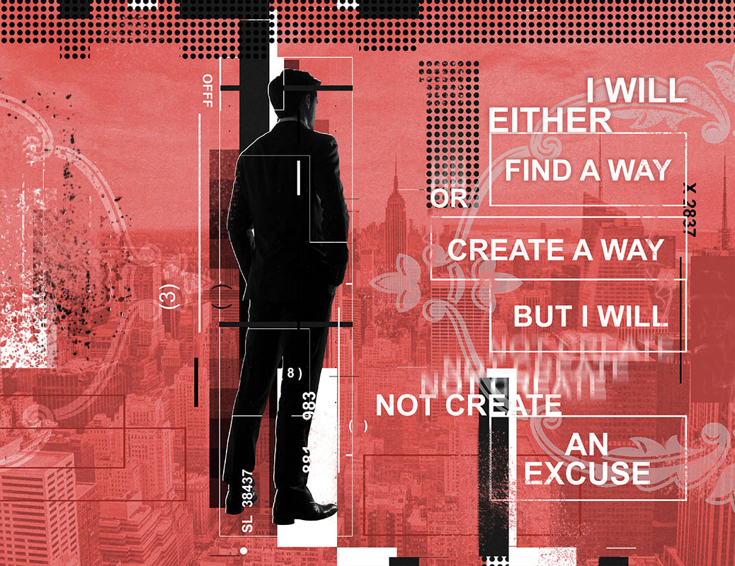
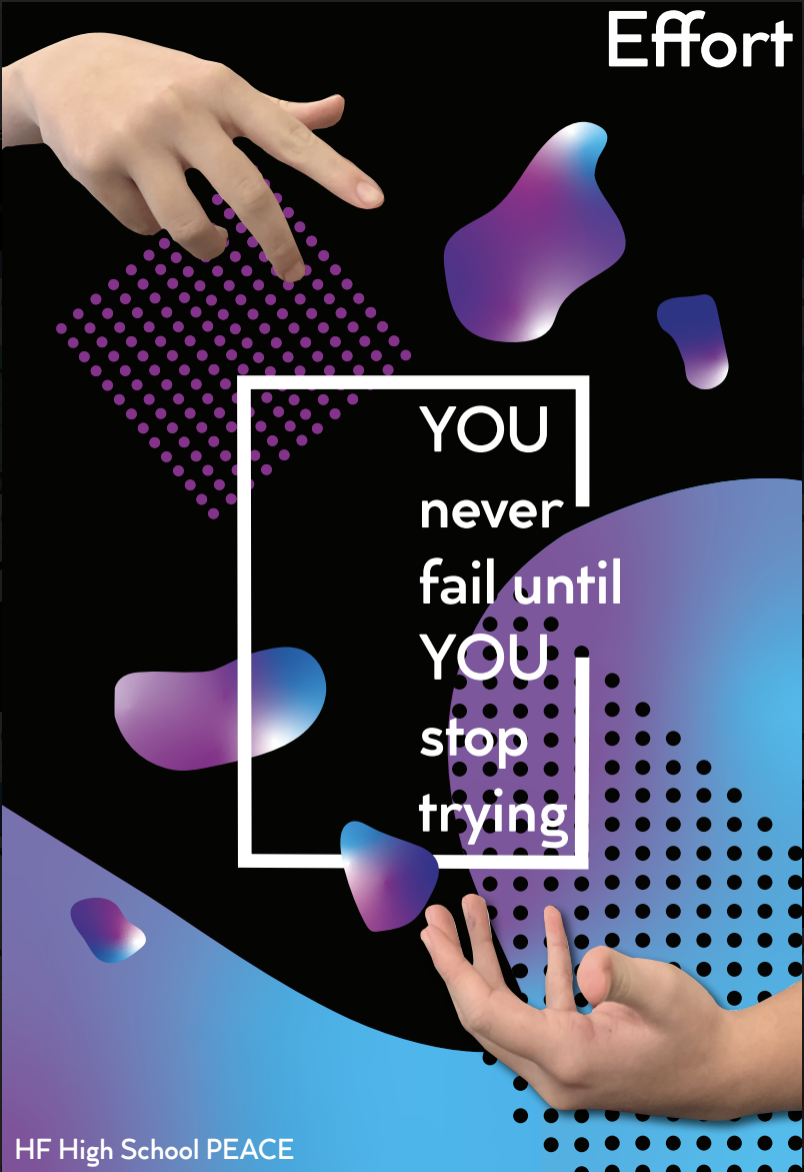
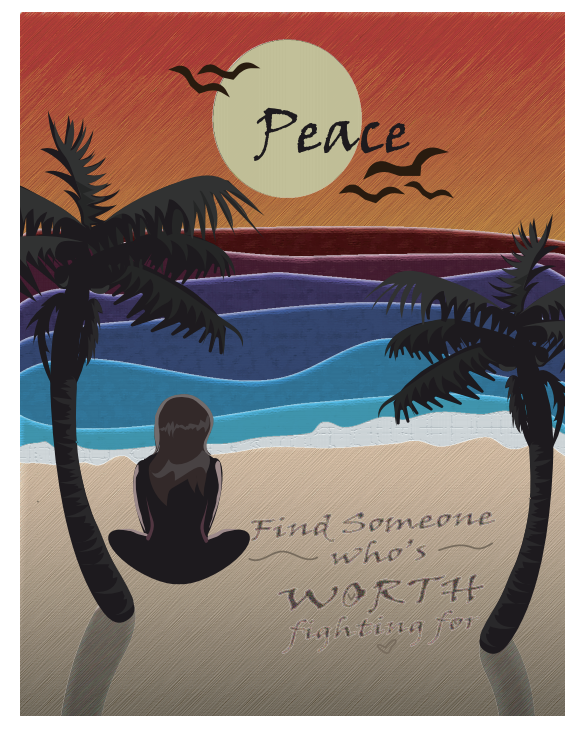
Positive/Motivational Poster
*Selected designs will be hung up all over school!
Positive/Motivational Poster
*Selected designs will be hung up all over school!
|
Positive Posters Project Outline:
Objective: Create visually appealing, positive message posters for our school. Students should work to create a visually appealing, easy to read, and easy to understand poster to hang on the walls of our school. You may use existing positive phrases, think of your own, or draw inspiration from the culture around us (music, movies, etc.) as long as the phrase is copyright free (if it will be on the poster). Start by Choosing an inspirational quote, saying, or positive message. This message can be illustrated and if the artist decides accompanied by text. TEXT IS OPTIONAL Criteria for Success:
|
|
Step 1. Choose a inpirational quote, saying, or positive message.
You are NOT required to have text on your design. The imagery you create can also demonstrate it's meaning.
Examples:
“Don’t Let Yesterday Take Away From Today"
"You Are Beautiful"
"Actually, I Can!"
"Dream It, Believe It, Achieve It!"
"Be The Best Version Of You!"
"Be Happy And Smile"
"Enjoy The Little Things"
"Make It Happen"
"You Are Beautiful"
"Actually, I Can!"
"Dream It, Believe It, Achieve It!"
"Be The Best Version Of You!"
"Be Happy And Smile"
"Enjoy The Little Things"
"Make It Happen"
13 by 19 Inches (vertical or horizontal) is the largest paper I have to print in the classroom. Keep your document that size or smaller.
All images must be taken by you or copyright free.
You may always draw over images/ templates for reference! It is highly encouraged.
All images must be taken by you or copyright free.
You may always draw over images/ templates for reference! It is highly encouraged.
Step 2. Choose a Style to Work From:
It doesn't have to be one of these, but I added some as possible inspiration!
NEON/ GRADIENTS

|

|

|

|

|
|
|
|
Forgot how to add a gradient in Ai or Gravit? Check the videos below!
|
|
|
DISJOI N T ED T EX T
or DECONSTRUCTION/ DISTORTION

|

|

|

|
|
|
*In this video was how to cut text in half, make clipping masks and adjust the kerning, leading and tracking that would help for text distortion!*
|
Geometric Shapes O < []
|

|

|

|
|
|
|
Digital Painting
Programs: Adobe Photoshop or Adobe Fresco (free for iPhone, iPad or most windows laptops/desktops)

|

|

|

|

|
|
|
|
These two underneath are by Aaron Blaise- Disney Illustrator! Worked on Lion King and more.
His Channel- lots of great things!: https://www.youtube.com/channel/UC0lLeNdvLrFozQRsQ1TQiAw
|
|
|
|
|
|
Vector Drawing

|
|
|
|
Student Examples:
|
|
|

|

|

|

|

|

|
|

|
|

|

|
Part C *COVER CONTEST*
Planner Cover Details!
SKETCH & FIND 1 REFERENCE BEFORE STARTING! (10pts)
http://graphicdesisn2lessons.weebly.com/client-projects-school-covers.html
